San Antonio’s ESPN San Antonio had a new partnership with the Texas Rangers. As part of the deal there was a small ad space available to the radio station they wanted to take advantage of to better hone in on the Texas Rangers MLB Partnership.
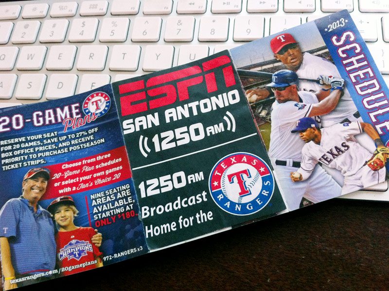
They handed me this image… someone cut and pasted and example onto the actual schedule so they could give me a good idea of what they were looking for.

This was the example ad the client currently had but wanted something a little more unified.
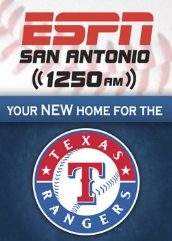
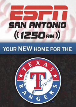
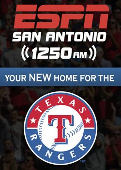
3½” x 2½” isn’t a Lot of space to work with so we wanted to keep the design simple and have it stand out from much of the other Texas Rangers advertising within the maze of folded panels. Stay true to your own brand image while brand alignment is always top of mind too.
If that wasn’t enough, some of the other ads within the brochure were very nice. So we also wanted to show a level of ascetic sophistication that was concurrent with the other nicly designed advertisments. We didn’t want to be the ugly duckling after all.
I believe each design has a very simple and straight-forward feel that makes the composition very stable and compartmentalized lending equal weight to each brand and using the division itself to bring them together with the core piece of copy I was given.
Designed in Adobe Illustrator CS6 By Delton Childs


