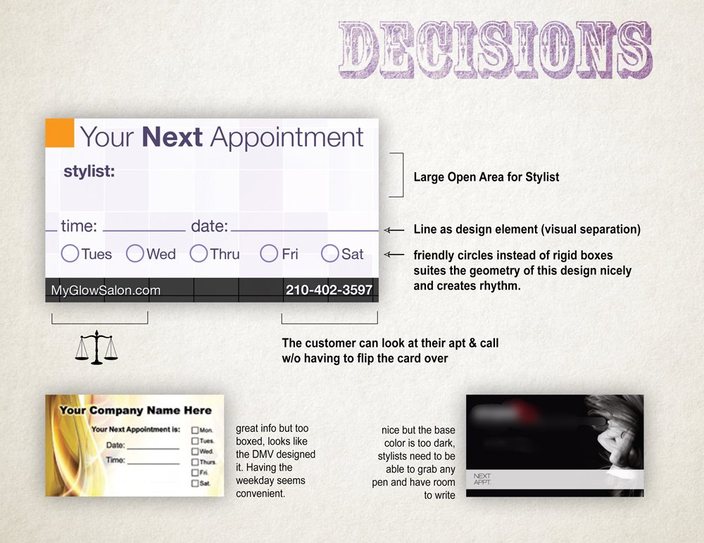
Glow Salon and Spa is a premium salon in San Antonio and they need a premium look. We designed a new appointment cards that each stylist gives out when the schedule their client’s next appointment. I looked at several “Appointment style” templates before I began the project to make sure I was including all the necessary info.
The Front – All About Beauty
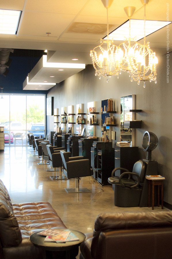
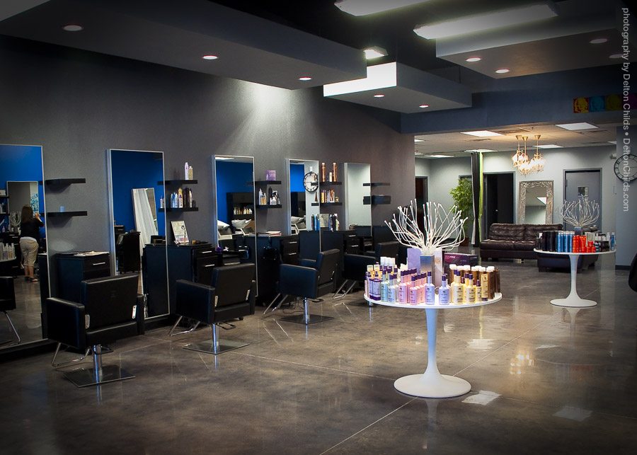
I decided to use an image I capture of their salon on the front of the card to show the beauty of the salon and I needed to include all the basic information like address, phone, and website. The square golden/yellow color chip placed in the bottom right-hand corner draws on the warmth of the salon image. It’s designed to draw the eye to where the information is printed on the card, specifically the phone number, giving it a little visual priority. Almost like a bullet point, but don’t call it a bullet point.
Ample Backside – Room to Write
The back side stands in contrast to the standard business card layout of the front in both style and tone.
I needed to use a light color for the back so the stylists wouldn’t have a problem grabbing a pen, anything pen just laying around, and writing the client’s next appointment so I went with a white background but included a barely visible pattern with the rich purple tones drawn from front image tieing the front and back together visually and including the same golden color chip in opposite top left-hand order, in this case where the important information on the card starts.
I just plainly didn’t like how the blanks for filling in the time and date of the next appointment broke up the design. It seemed it had to be done though. I took the two lines for time & date and let them go off to the bleed (off the edge of the card), creating one solid line. Now I only had one line to deal with! I used this line to condense all the information into the lower 1/3 of the appointment card. Giving the stylist a generous amount of space to write their name or whatever else they needed.
Infamous “Check-Boxes” – What Day Is That?
The “check-boxes” for the days of the week were very convenient. The stylist would probably write an actual date. That might make the customer figure out what actual day of the week that is, so the day of the week boxes make perfect sense for the sake of convenience. Circles. they seem open and friendly, you almost WANT to check them or fill them in. The circles play nicely with the strong geometry. The circles for the days of the week they’re open help me avoid yet another square and create rhythm instead of making the design look like a questionnaire.
Lastly, I wanted to include the phone number on the back in addition to having it on the front. I thought about this because I could imaging a customer looking at their appointment in their hand and wanting to call the salon. Again, for the sake of convenience, now they don’t have to flip the card over to get the phone number, all the information they need to contact the salon about their next visit is right there.
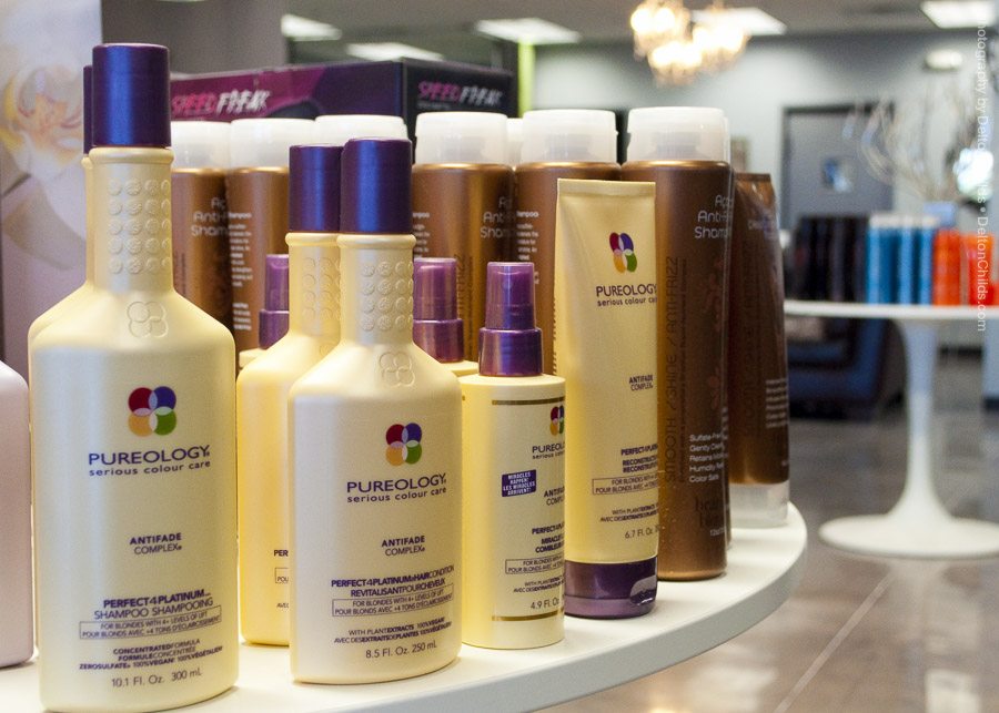
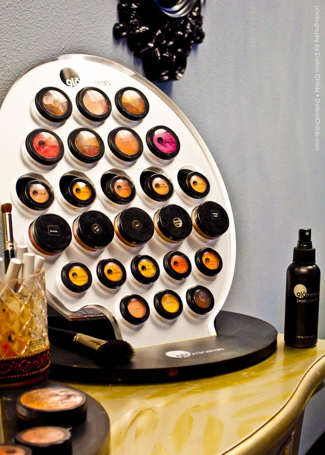
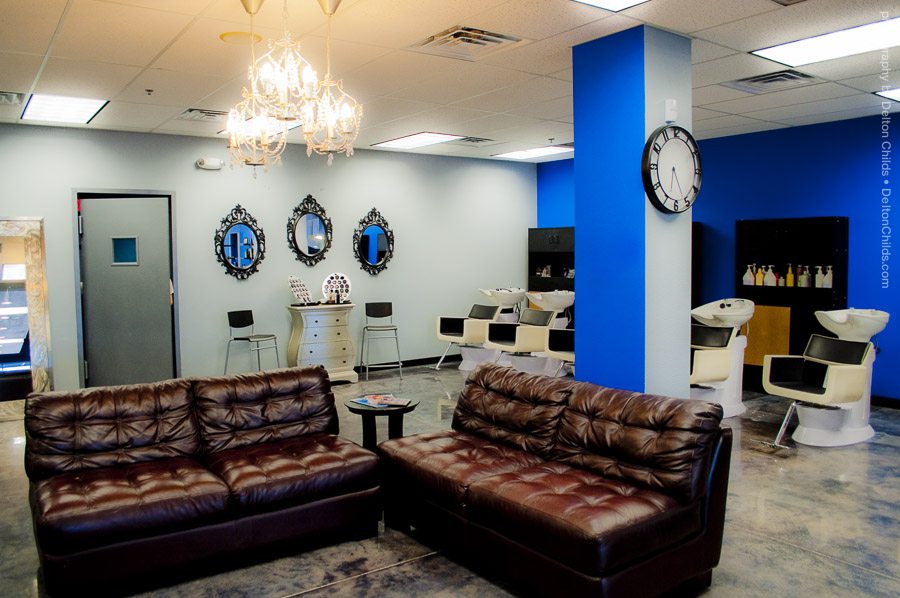
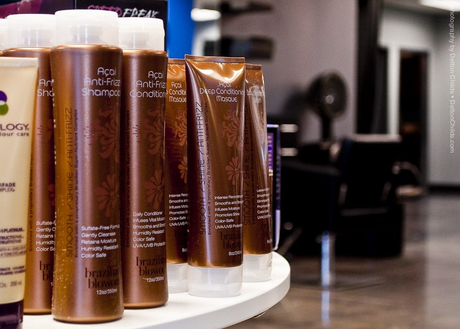
We had done some basic storefront photography for Glow Salon a while back, so these images served as good production materials for this project. It was nice having high-resolution images to work with right out of the gate on this print project.