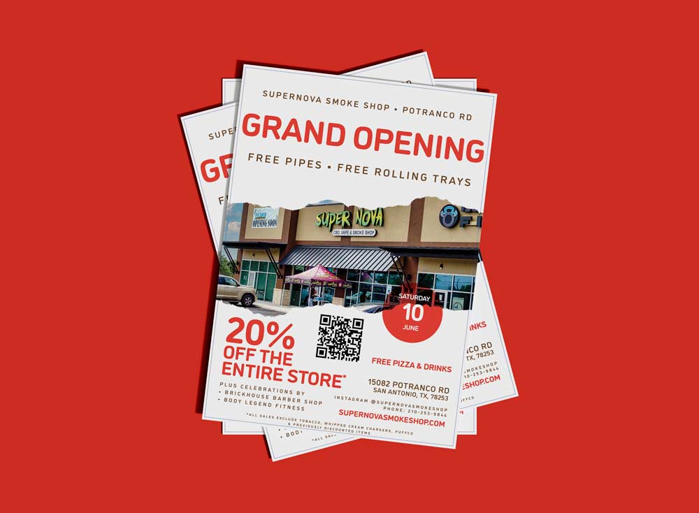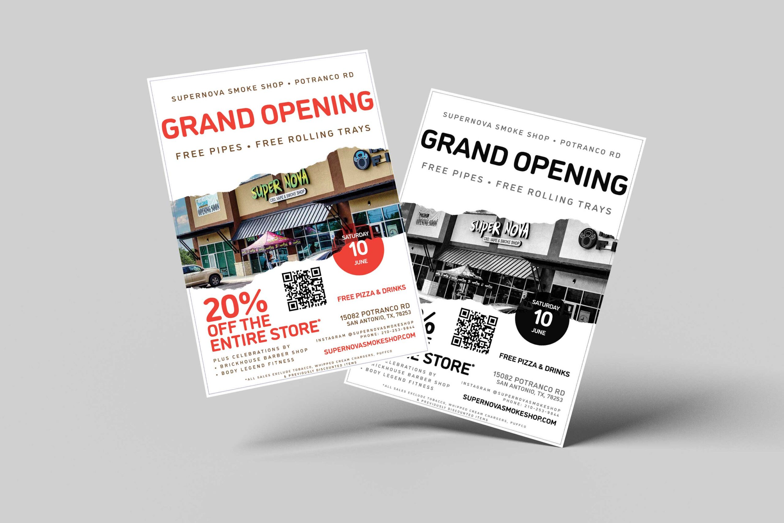
As a designer, one of my recent projects involved designing a single sided print flyer for the grand opening of a new location. My client wanted a minimalistic approach to the design, which would help them achieve their marketing goals. The goal was to create a flyer that would be eye-catching, informative and memorable, all while keeping it simple and clean. While that’ the goals it doesn’t always turn out that way because of marketing requirements given to you by the client. This little flyer had a lot of text associated with it, including the website URL, businesses participating, sales, QR code, location, Instagram handle, and more.

To achieve the minimalistic look, I used a simple color palette that consisted of black, white, and a pop of color. I also had to create a black-and-white version of this flyer, ensuring the color palette would be suitable for printing monochrome, which can be difficult if you’re not choosing the right colors. I also chose a clean sans-serif font that was easy to read and added some white space to the design to make it less cluttered. By using fewer elements up top, I could draw attention to the critical information, such as the location, date, and time of the grand opening, as you visually move down the flyer. I found a little bit of peace in starting with a minimalist mindset and then allowing myself to slowly break free from that as project requirements increased.
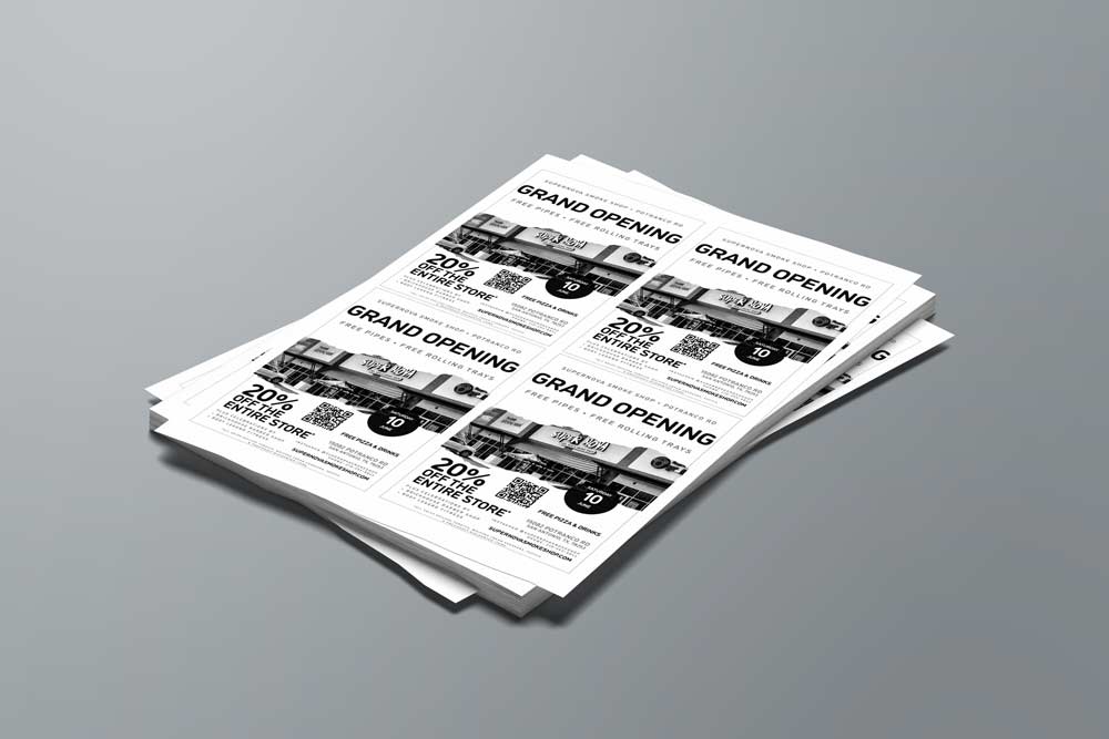
Throughout the design process, I kept in mind that a single sided print flyer needed to be effective in communicating the message without overwhelming the viewer. I was given less than 24 hours to come up with this design composition and due to the time constraints of printing they asked for a 4 panel Black and White copy to easily distribute to their 9 locations. The minimalist approach made it easier for people to read and understand the information at a glance. By keeping it simple, this design was able to achieve its marketing goals and help my client create a successful grand opening for their new location.

Designing a single-sided print flyer for a grand opening required careful consideration of both aesthetics and marketing goals. By using a minimalist approach, I was able to create a design that was visually appealing and informative while keeping it simple and easy to read. This approach ultimately helped my client achieve their marketing goals and create an impactful grand opening event for their new location.


0 Comments