I was contracted to design ANOTHER new location flyer for SuperNova Smoke Shop. We went through 2 design rounds on this project. The first round was a propaganda-style poster that ended up coming off as too aggressive in a conceptual composition. The “Adventure Theme” we used for the final design was what we ended up sticking with.

We started by finding a nice stock image that would suit our “Adventure” theme. We wanted customers to go seek out the new location if it is a quest or rite of passage. We had to composite the waterpipe into the scene as the relic on the pedestal and since our character looked kind of confused we decided to put a joint into our adventurer’s mouth.
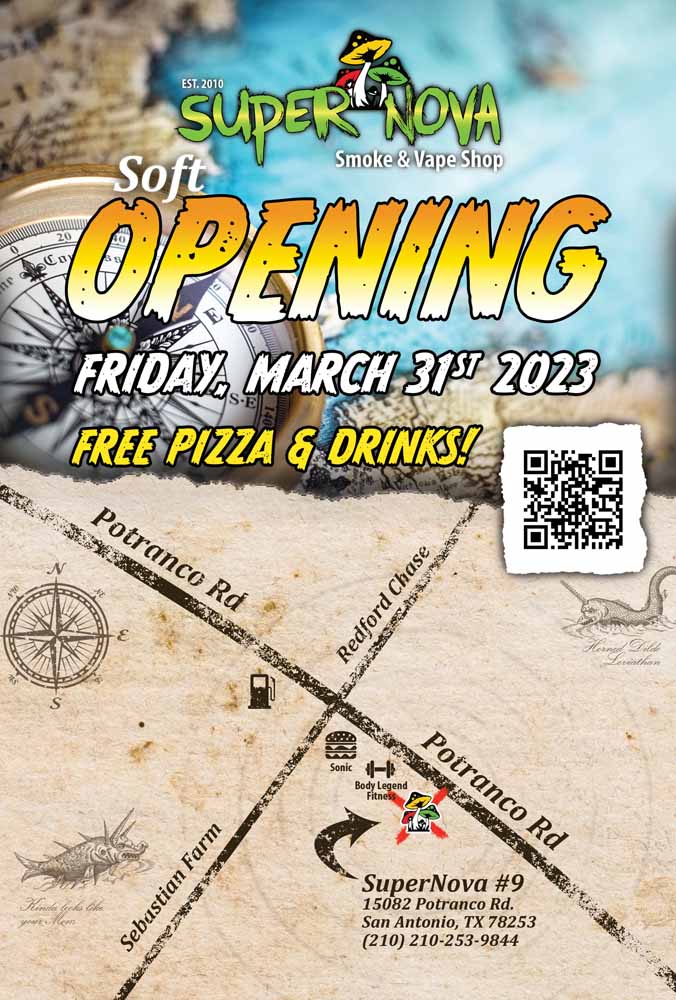
The map on the back was made entirely from scratch. We started by taking a screenshot of the location on google maps and then moved it into Adobe Illustrator for tracing and labeling. The client will be able to use this design resource on further marketing materials for that location. The originally designed map elements are less stylized. This map was adapted from the one we created and given some flair to maintain the old-world design aesthetic.
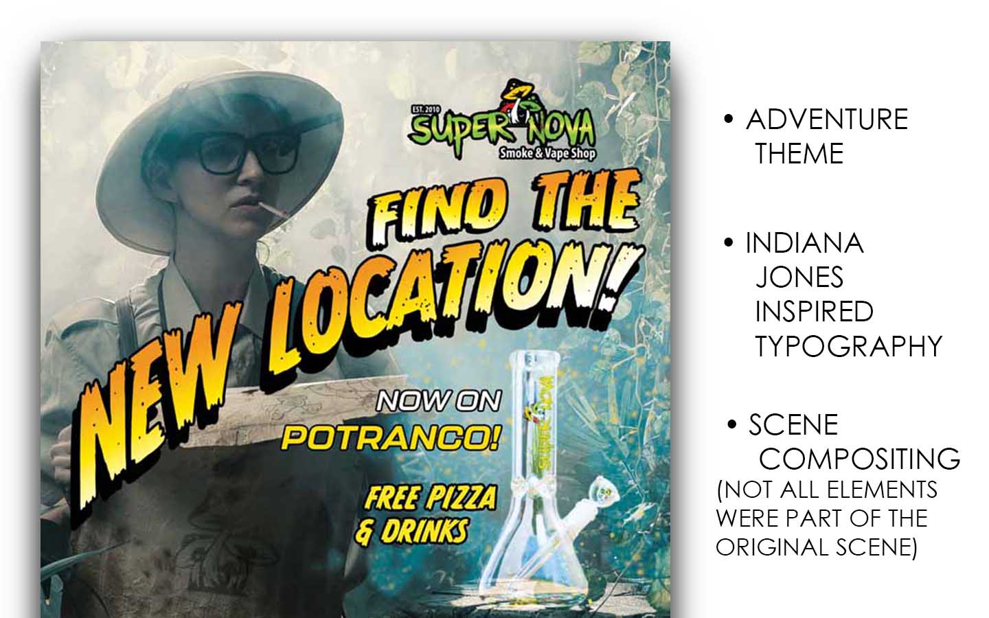
In this detail of the front of the flyer, you might notice that the typography was inspired & adapted from the Original Idnidana Jones and the Raiders of the Lost Arch movie poster.
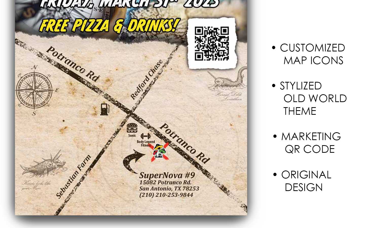
The map elements have been carefully composited on the map and texturized to maintain an aged appearance. Little ocean leviathans and the map compass were added as accenting design detail.

